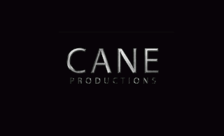
Production Company Logo Practical
Introduction
For our final submission piece of coursework we will need to
have a production company logo in the introduction. Production companies are
always shown in the opening scene of a film as they are the main benefactor so
to make our coursework look professional and effect we will need to include a
production company logo or introduction.
For this task I took inspiration from logos like SUMMIT and
STRADA. The use on the black background and the image above the name of the
company (which was written in capitals). I found this effective in its
simplicity, the use of the black background can be used for several different
genres as it has the same neutral effect a white one has but, the contrast with
the logo and text seeming like light through gaps make them more effective and memorable.
Process
I took inspiration from the text tutorial we did in Photoshop
and used the metal effect that I created to do the text, the brushed silver
look made the text look appropriate for the drama genre as it was neat and
square but had sharper edges symbolising the hidden problems some films
represent. I created the text using this effect and took the image of the (CANE
PRODUCTIONS) and placed it on a power point slide which I had formatted to have
a black background.
I found that by just having the text made the image boring
so I found a picture on the internet of a metal effect in a circular pattern.
I
used this image and edited it so it was three separate prints creating one. This
helped to cultivate the production company logo and created a sophisticated image
that look professional and simple.
By merging the two images together in a similar format to the SUMMIT logo I created the final image needed to create the main logo of the production company the final image is effective and professional like I wanted it to be.
For the final product I decided to use a metallic sound,
like a knife sharpening, I felt like this had the effect I desired as it made
the image shown seem more dangerous. This lends itself to the drama genre as it
gives the idea of a conflict. I felt that the short video should be simple with a fade in and fade out making the still image seem more solid, emphasising the idea of the metal.
Final Product


No comments:
Post a Comment