Photoshop Text Manipulation Practical
The first Photoshop experience I had with text manipulation was completed by going through all the options available and exploring how to add different effects to the text.
First Attempt
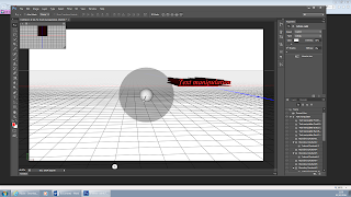
I started with an empty document that I added the sample text to and adjusted the size so that I was able to read it. I edited the size of the font using a tool bar along the top of the page.
Next I once again made the text larger and made it 'stronger' playing with the softness that was available for the text. carrying on along the toolbar I manipulated the words to become a different shape, the text was arced.
I changed the colour of the text to red so that it would be more visible as I looked through the options.
Later I changed the depth of the words on the screen, changing the angle for a brief minute to see how much longer they were.
I found the light direction manipulator next, changing the angle that the light was hitting the text illuminating some sides.

After that I flattened the image and added a coloured background.
The second attempt
The second time I used the Photoshop program I followed an online tutorial, the finished product was more refined and more appropriate to the research I had been following.
I created a new document and created the word 'blur' in white capitals on a black background, I then rasterised the image so it was all pixels and it was easier too add the effect to.
After this I edited the layers that were shown
The tutorial told me to copy and duplicate the layer that had the 'blur' present on it. these would be used to create the effect.
I was instructed to do this so that there were four copies of the layer.
The first 'blur' copy layer would have a filter added to it, this would be the 'motion blur'.
I read that the blur itself needed to have a 90 degree angle with a distance of 150-155
After this I would add the same blur but at 0 degrees to another layer before merging them together.
After this was added I would then use a different type of blur a 'Gaussian blur' that would make the whole word softer and give it a glow.
The final product:
Third attempt:
After completing the 'blur' text I did another tutorial but this one was for creating a metal effect.
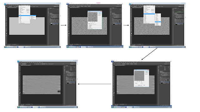
To do this is first created a new document with specific sizes, this was so that when I cropped the document later there would still be room, I then made the layer black. Next I created a new layer and made it a specific shade of grey; 195 in R,G and B.
I then added noise to the new layer, by making the static effect on the grey and then effectively smudging it I created a brushed metal effect that I then cropped to get rid of the untidy edges that were not as effected.
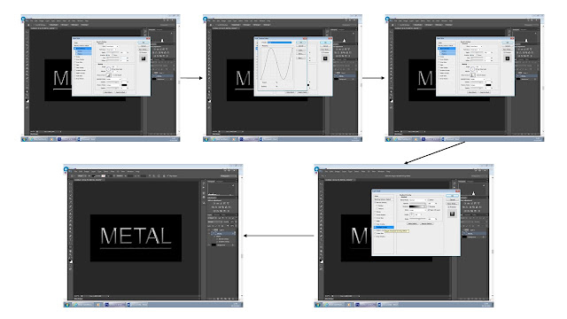
I then added text as a separate layer, this only said 'METAL' as it was a sample of the metal effect that I would be creating. I then moved this layer so it sat between the grey and the black layers, this meant it was no longer visible. by using the option of the clipping mask the text became visible.
After completing this I started to add the different effects to the text that was show, by choosing the 'bevel and emboss' option the text slowly became textured. This was done by editing the structure and gradient overlay.
After adding the first layer of texture I added another layer. I used the render option to add the edited image of clouds to give the shadows and highlights of the light catching the metal. By smudging this it created a soft glow effect.
By the editing the blur it then created a realistic brushed metal effect that completed the final product.
The final product:


No comments:
Post a Comment