Friday, 30 September 2016

SE7EN Opening Credits analysis


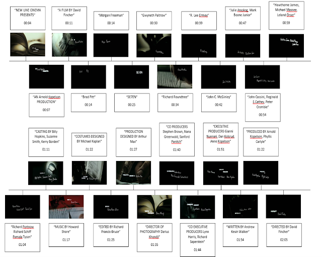
As you can see from the timeline above the total number of credits and actor names shown during the opening is 26, main actors such as Brad Pitt and Morgan Freeman are given their own black screen isolated from the actions going on screen. This is because these are A class actors, the main actors and the company want to show the audience what type of cast they are getting in hopes of showing them the level of film they are getting. The credits then progress as normal showing the range of people important to the production of the film.

Typography   

The style of typography used during the opening credits of SE7EN is very relevant to the genre of the film and is successfully executed through the use of editing. As seen in the picture below the letters of the words are have very sharp points and ends to them, are never seen written on a straight line giving it the element of unstability, reflecting the mind of the character shown in the opening. These effects make it feel as if it wasn't done with a pencil but it was done with the use of a sharp object (the razor shown further in the film) and scratched onto the surface. The use of editing is also prevalent in the text and typography used, the words are edited as if they are glitchy and jump about, giving it a type of warping feeling further reflecting the type of character we are going to be exposed too.

Genre + Mise-en-scene

The genre of SE7EN can be identified as a psychological horror, evidence of this is shown through the opening scene of the film through the use of visuals to sound. The opening of the film instantly conforms to the common conventions of a psychological horror, the use of a book or a diary (confirmed nearing the end of the opening scene) can be seen this is due to the diary being a straight relation to the thoughts and ideas of whats going on inside the mind of the killer. The colour of the scene is a more dark/grey hue throughout giving the impressions of death, evil and mystery. Often times the killer is shown writing in his diary, cutting out snippets and cutouts from the bible and other sources making his own type of 'bible' that he agrees with.


The killer is then seen using a razor (presumably the same ones to etch the names in the credits) to carve and cut out the skin on his fingertips (can be identified as male due to rough, calloused hands) this is to rid of the DNA evidence that can be left, reducing the chances of being caught and showing intent to cause a crime. Giving the impression that the killer is cunning and not a sociopath, as sociopaths' have the tendency to exert violence and killing mindlessly without thought for consequences. It shows that the killer is cautious and further heightens the unstableness of the killers mind, going through the pain for such goals.


Another common convention of psychological horros is conformed through showing the obsession the killer has to something; god. Presenting that the killers motive is a religiously driven on, he is seen cutting out the word 'GOD' from another book fuelling the idea further.  there are many times where the references to the bible and the word god appear on screen, many times the killer can be seen blacklisting things that he dosEn't agree with and disapproves of. Often times with a single black line through the eyes of peoples pictures, almost as if its a hit list and just covering the eyes of a person removes their individuality generating a disturbing and uneasy feeling to the audience.


The opening progresses and the development of the diary or bible being made gets progressively faster along with the soundtrack as he beings to construct the actual book itself cutting wires, and the use of a needle to thread the pages together is just an eerie sight in itself as the one holding it is an unstable psychopath adding a sense of danger and invoking a sense of dread and fear. As the music gets faster so do the jumpy, glitchy edits wrapping up the ideas and moulding the idea of an unstable killer.

Sound

During the opening credits of SE7EN the use of non-diegetic sound is the only form of sound, only a soundtrack was used but the simplicity of it helps to emphasise the creepiness. The soundtrack is a synthetic made beat which immediately starts of the film with a loud, intense and eerie beginning. Having the music start  of like this gives me the impression that there is no purpose to try and build the tension as it's already there. The soundtrack changes three times to make sure the same level of music isn't that same throughout.

Thursday, 29 September 2016

AS Media "SE7EN" Title Sequence Deconstruction

"SE7EN" Title Sequence Deconstruction


Brief


The iconic title sequence for "SE7EN" is embedded below:


Genre


From this clip alone we were able to gather evidence that allowed us to predict the genre of the film. Listed are the genres we identified:
  • Crime - There is an extract in this opening of someone removing fingerprints. This would suggest the persona has an intention to commit a crime and, therefore, we made a link to this genre. There also seems to be shots of photos being developed, which upon first viewing could suggest some kind of evidence for a crime scene along with the newspaper clippings shown.

Above: Extreme close up.
  • Horror - A non diegetic soundtrack is used and is parallel to the somewhat disturbing images of blades and needles. The sound is creepy due to mechanical creeks, whirs, metallic ringing, screams, radio feedback and loud crackles similar to lightning, all of which are hair-raising. With the removal of fingerprints to commit a crime and the menacing image of crossing out a person's identity, which suggests death, we assume that there will be a murder. Murder is not only a common convention in crime, but also in horror. With the sound, we use these observations to determine that the film is a horror.
Above: Extreme close up.
  • Psychological thriller - Throughout the clip, a clear obsession of the unknown character is displayed. This is shown by the excessive writing and scrapbooking of collected and specifically selected images and clippings. A diary, similar to what we are presented with in this title sequence, is repetitively featured in psychological thrillers to show the complexity and obsession of the killer. Hence, we suspect the character in this scene is the film's antagonist.

    Within this diary and plan for the foreshadowing murders, there are constant biblical references. Text like "transsexual" and "pregnancy" which the antagonist disagrees with are erased, while religious text including "God" are precisely cut out. The character is manipulating these texts and warping religion, further supporting the idea of a complex motive. The title "SE7EN" appearing randomly with glitches shows its significance. With the occurrence of biblical references and this title we can deduce that the plot revolves around the well-known seven sins.
Above: Extreme close up.


Timeline***


Below is a chronological timeline displaying the credits and every piece of relevant text on screen throughout the opening credits. This will help me understand title credits common in opening scenes.


  • 01:11 - CASTING BY Billy Hopkins Suzanne Smith Kerry Borden.
  • 01:17 - MUSIC BY Howard Shore.
  • 01:22 - COSTUMES DESIGNED BY Michael Kaplan.
  • 01:24 - EDITED BY Richard Francis-Bruce.
  • 01:26 - PRODUCTION DESIGNED BY Arthur Max.
  • 01:35 - DIRECTOR OF PHOTOGRAPHY Darius Khandji.
  • 01:40 - CO-PRODUCERS Stephen Brown Nana Greenwald Sanford Panilch.
  • 01:44 - CO-EXECUTIVE PRODUCERS Lynn Harris Richard Saperstein.
  • 01:50 -EXECUIVE PRODUCERS Gianni Nunnari Dan Kolsrud Anne Kopelson.
  • 01:54 - WRITTEN BY Andre Kevin Walker.
  • 01:59 - PRODUCED BY Arnold Kopelson Phyllis Carlyle.
  • 02:04 - DIRECTED BY David Fincher.

Then ends with post-production text MONDAY.


Production


The majority of the clip is edited with a sickly yellowish and greenish hue with the occasional presence of red. These colours are chosen not to be vibrant further supporting that the genre is most likely to be a psychological horror, as the cinematography of this genre is commonly described as very dismal and 'gritty', due to its darkness. This choice of colour and mise-en-scene is occasionally used in crimes. Though in crimes and urban dramas there are more prominent and exaggerated colour tints like red, blue and perhaps even neon colours displaying the night life in such dramas.

Above: Extreme close up.

Old-fashioned props like: a needle and thread, reels of film, a splicer, blades, notepads, textbook images, newspapers and developed photos are used. If modernized machines were used, the clip would lose its unsettling effect, as the killer seems far from the modern world and further showing his isolation from the world; suggesting he is 'insane' and peculiar. These also add to the idea that they are planning their murderous work and has a clear, chilling motive.

Above: Extreme close up.


Post-production


The non diegetic soundtrack is immediately fast-paced and intense. This can suggest that there is no need to build tension, hence, reflecting the already minacious state of the killer. Alternatively, the soundtrack seems to change roughly three times to still keep some level of suspense. This unusual choice could further relate to the peculiarity of the antagonist.

The font used is like a rough style of handwriting. This could be a fragment of the endless journal writing shown in the opening. The fact that this might have been copied from the diary and the font looks carved due to its pronounced edges, conveys the passion and perhaps anger applied when the killer is writing and planning. The titles are even written slanted, once again suggesting that the font is from the journal.


The text also seems to 'glitch' around the scene and some cannot be translated as they are very brief and jumbled flashes of letters, which adds a form of disorientation. Most of these jolty movements also seem to be in time with the non diegetic sound, further increasing suspense. Linking this observation back to the idea of the font being directly from the antagonist's diary, the unexpected movements could represent the instability of his mind.

The black background of these titles seem to be used for the more famous actors and important crew, as the white contrasts with the background and allows us to focus on the names. The black background can be interpreted as a chalkboard or a light box due to the flickering glow of capitalised titles. This links to the idea of the killer planning and targeting certain names/characters.

Upon scrutinizing the clip, I found there was a few subtle hints to the absence of Kevin Spacey's name in the credits, who plays the important antagonist. These included the scratchings and vandalism of writer Andrew Kevin Walker's name and also a flash of scratch marks that seem to spell out "NO KEV". This could just be coincidental, however, from the clever and specifically edited sequence we can assume these are intentional. Not including a successful actor's name means that the audience does not wait for Spacey's appearance and figure out that he must be the killer.

SE7EN Opening Credits

SE7EN Opening Credits- Timeline
Timeline
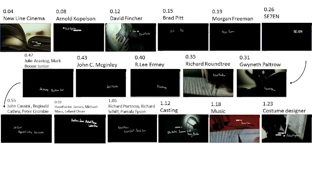
As you can see in the timeline above, before any identification of the film is made there are five credits shown. These include the studio, the makers of the film and the two main actors in the movie. These two actors were the most well known in the film so it is assumed that they were paid more, this will explain why their names were credited before the main films title appeared.

After the title has been given (SE7EN) there are twenty more credits that are shown, these start at the names of the featuring actors in the film, then it moves onto the other, behind the scenes parts e.g. the costume designer, the production designer, the producers and so on. The final credits included the writer, producer and then the director in that order. This order of credits follows the basic order of credits where as if they were at the end of the film they would be in reverse order.

Typography

The typography for the scene was done by scratching words into a black board and then placing the board onto a light box so that the light shined through the words. This was then scanned in and edited into the scene. The typography it makes is reflective for the genre as it looks scratchy and uneven, the script never in a straight line, giving it an unstable feel. This although noticeable doesn’t draw too much attention away from the images and short clips shown between all the credits making the scene flow freely. Capital letters are used in a similar but different font as titles for different people, for example one credit will say; DIRECTED BY David Fincher.


Genre and Mise-en-scene
The genre of this film (psychological horror) is shown throughout the film opening with blatant obviousness using the music and the images shown to create an unstable narrative. This generates a feel of unease for the audience as they watch the film with an obvious knowledge. The use of images with the eyes crossed out to represent the killer’s victims is commonly seen in horror film but the actual images of him using a black marker to completely black out the headshot of a man as the screen flickers causes the whole scene to give out a creepy atmosphere.


There are also shots of the opening where you see the man peeling his own fingertips. This was done using a razor that he was holding, he did this so that none of his DNA would be traceable further supporting the ideas of a horror film as the audience wonder why he would want to remove them. This helped the scene to exude the unstableness that the music and the darkness create.
Books and text are also seen a lot through the whole scene, handwritten and typed. There is an idea that the person (killer) in the scene is writing his own bible through the scene as the seven deadly sins are hinted at throughout. You can see the man blacking out words in the text such as ‘Transsexual’ on the typed text. This, as well as references to the bible give the idea that he is doing this for religious reasons.
As the scene continues you see the man cutting out images and cells and taping them into his own book, you also see a close up of a needle that is used to sew two parts of the book he is creating together. This generates a menacing image as you are unsure as to what he would do with the needle considering he just used a razor to remove his fingertips. This image supports the idea of the unstable ness of the scene making the man seem more dangerous.


At the end of the credits you see the man start to cut out the word ‘God’ this confirms any ideas that the killer will have some sort of religious based motive, it may also have the impression that this is an obsession which would conform into the conventions of horror films.


With the scene being so unpredictable with the footage shown being static and unstable it finalises any ideas of the film being a psychological horror film.


Sound
0:00- 0:49
Music starts with a loud thunder like noise before quietening to a steady synthetic rhythmic noises over the top that are synthesised; these include robotic like sounds and a repeated static like screech that is familiar to the sound of a record going wrong way. This makes the viewer uncomfortable as the sounds are not easily heard and are quite sharp and unpredictable creating a tense atmosphere.

0:50-1:13
Warped high notes and wind like sounds have been added to the slightly louder tempo, the rhythm slightly faster, this is keeping an eerie feel to the sequence.

1:14- 1:34
The music is all still synthesised but there are more layers to the sound, the music is slightly faster building the tension slowly and subtly with the images shown on screen. There have been a few high notes like chimes added.

1:35- 2:00
Rising and falling sounds like an accelerating motor have been added, helps to build the suspense even more as another dimension to the music has been added, re introducing the squeaky record sounds and keeping the eerie atmosphere.

2:00- 2:09
The music breaks as the single line ‘You get me closer to God’ is sung in a deep but slightly spiteful voice. The clip ends with a loud thunder like noise that it starts with. The sound slowing off as the last credit is shown.

Throughout the title sequence there is only one line of dialogue and no diegetic sound is heard, only the heavily synthesised score.


Wednesday, 28 September 2016

SE7EN opening credits

SE7EN opening credits

Timeline


This timeline shows which titles appear when in the opening credits of the film SE7EN.

Genre

The genre is identified in the opening credits of this film due to the use of sound and the plot within the credits. It shows someone writing a diary which is a common convention in the psychological horror genre as it is all about the unstable mind of a character. He is also crossing out words in books that he does not agree with such as "transsexual".


There are also references to God which suggests it is a religious reason that he is crossing out words in the book. You see the person cutting skin off their finger tips to remove their finger print which along with the clip where he crosses out someone's face, starting with their eyes, it gives the impression that he is killing people who do not follow the rules in the bible.


This also conforms to the common conventions of a psychological horror as the killer has an obsession. You also see the person cutting out photos and pieces of film which adds to the idea of their diary and how the character needs a diary to try and stabilise his unhinged mind. These clips are effective as they all contribute and add to the impression that this is a psychological horror identifying the genre in the first two minutes of the film.

Mise-en-scene

The mise-en-scene in these opening credits help to identify genre and give clues into the story line. for example the diary illustrates how unstable he is that he needs to write down what triggers him.


There is also a close up of him removing his finger prints which leads the audience to believe he is a criminal trying to protect himself. This is expanded on later as he colours in someone's face starting with their eyes which is usually linked to the idea that they have been murdered.


After all these hints have been given away about how unhinged this character is the needle at the end although it is only used to sew together some sheets of paper it seems a lot more menacing and dangerous. He is so mentally unstable we do not know what he is going to do with the needle to start with.

Sound

The sound in the opening credits for SE7EN does not have any lyrics in the song or dialogue.
00:00 - 00:52 - During the first part of the opening credits there is a regular beat underneath some random synthesised noises that are not comfortable to hear which adds the psychological horror genre because of how the character is not at ease (he has an obsession and its mentally unstable).
00:53 - 01:13 - The regular beat continues and is overlapped with a high pitch noise that is like wind but has been synthesised to make it seem even more eerie.
01:14 - 01:34 - The music starts to build in volume and speed as more noises are added in to build up tension. The noises are still uncomfortable to listen to which is in parallel with what is happening on the screen (removing finger prints/colouring in people's faces)
01:35 - 02:00 - The music builds to start to become an actual song that is heavy and loud but has a steady rhythm. The music consists of electric guitars, drums and some synthesised sound to continue the idea of the music reflecting the character's unstable mind.
02:01 - 02:05 - "You bring me closer to God" - These are the only words in these opening credits and having the word God in it helps to highlight the religious aspect of this character and his obsession with making sure everyone obeys the rules of God as in the bible.
02:05 - 02:06 - The sound finishes with a loud noise which emphasises the end of the credits and the beginning of the film.

Typography

The typography in the opening credits for SE7EN use an appropriate font to identify the theme. The font uses capital letters for the title of the person (e.g. executive producer). The font for the name of the person is in a font that looks hand written as the text is not in one straight line, and as if it has been scratched in by someone because of the clearly defined edges. This adds to the idea of the character having an obsession because he must have spent time and effort scatting out those names.


The white text on a black background is very effective as it is not to eccentric so it does not distract from the clips of the person which is what will be giving the most clues into the story and are vital for identifying the genre.
The text does not just appear on the screen in these opening credits, it flickers on the screen and does not sty still for long. This reflects the unstable mindset of the character which is illustrated in the clips of the person as well as being demonstrated slightly through the music.


Evaluation

I like the typography in this film opening as it is creepy and suits the genre. We are going to make a film opening (not opening credits) so we will not need this much text. This also means we cannot do the short clips as we don't have any text to disperse between the clips so it would not make sense.


Tuesday, 27 September 2016

AS Media Blake Neubert Source Of Inspiration

Blake Neubert Source Of Inspiration


Brief


I aim to look into an artist called Blake Neubert as a source of inspiration to hopefully prompt some ideas of how to use gore and apply it to different horror sub genres, or if I'm lucky genres beside horror. This was inspired by the gore in 'zombie' horrors.

Research and Planning


Blake Neubert is a painter mainly known for his art labelled as 'scrape art'. This is where a base layer of a drawing is obscured with a thick layer of paint. This paint conceals what lies underneath from the audience. It is only until Neubert uses a razor to scrape off the supposedly normal subject we are subjected to a very gruesome underneath.

The videos of these pieces are promoted on Instagram and receive many mixed views, most voicing how disturbing and offensive the art is, while others praise the idea of 'disclosing the truth'.


Some of his work is influenced by unsolved murders or allegations. Famous examples include the following:
  • "The Black Dahlia" - A publicized unsolved murder of Elizabeth Short nicknamed "The Black Dahlia" is portrayed in the below art. This work involves the before and after of the attack, and uses the graphic picture of her mutilated body as a reference.
  • Nicole Brown Simpson's murder - The murder of OJ Simpson's ex-wife is another unsolved murder involving the prime suspect of OJ Simpson. This well known case has led to documentaries, theories and TV shows. However, Neubert used the contrast between Nicole's dark end and celebrity Kim Kardashian's fame to 'reveal' the supposed truth Kim Kardashian's father and OJ Simpson's defence attorney covered.

Other pieces do not capture a horrific story, however, they are equally creepy. For instance, there is a series of paintings which made the carnage more blatant and instead erased the identity of the subject. Alternatively, a few among this series still incorporated a characteristic to identify the subject, like the popular superheroes of the 'comic' franchise below. Superheroes are supposed to be strong childhood heroes, however, 'skinning' like them any other of Neubert's subjects plays with this expectation.


Because of this, I am unsure which is more menacing: erasing most features we distinguish ourselves with and manipulating the remaining identity or almost 'rebranding' famous characters into horrific alternatives.

Genre


Obviously from the graphic content, this immediately made me connect the art to the genre of horror, as gore is a common convention used, especially in 'slashers'. I also chose this as inspiration as I thought it was fitting after previously analysing the 'zombie' horror "28 Weeks Later".

To connect these pieces to the task of producing a film opening or title sequence, I regarded the artist as the villain if we were to make a horror to help come up with the following ideas:
  • The antagonist can have drawings of their victim's anatomy - If the villain has sketches of these distressing images it will show the villain is planning and has a motive. This represents the villain as besotted and complex, which is a convention of psychological horrors. This could just be recurring drawings of teeth or muscles/meat similar to Neubert's art below. I believe this would only make sense if used in the title sequence like a reference to the villain or if the opening introduces the villain.
  • The razor could be featured as a weapon - In horrors the killer either murders carelessly (common in 'slashers') or kills with a signature weapon or a 'style' (common in psychological horrors). If we decide to create a horror, we could bear this in mind and conform to the appropriate convention.
  • Gore will be heavily used - Make up and other effects would most likely be used to easily identify the genre of the video as a horror, for example in "28 Weeks Later" gore was used.
  • There could be multiple or past victims - Like mentioned earlier, the villain could reference multiple victims through a collection of sickening pictures. If this was done this would further develop the complexity of the character. This can even link to the genre of crime, where perhaps there is a serial killer on the lose, hence there being multiple victims. Or the detectives could have a case file with before and after photos of victims (there usually is forensics taking photos of a body in most crimes). This is influenced by the before and after 'scrape art' clips.

Source of inspiration - music video

Source of inspiration

Source

My source of inspiration is the music video for Lukas Graham's "seven years". This is great inspiration for an urban drama as it contains lots of locations and editing techniques that would be useful when making a film in this genre. 
This is the video:

Plot

The story line in this music video is inspiring because it is about how from a very young age this boy has had a rough line demonstrated when he says, "by 11 smoking herb and drinking burning liquor." However, by the end he has overcome the problems of his childhood and is touring the world with his band, he also has a wife and children. This would conform to the conventions of an urban drama as it is clearly a rough part of a large town. Demonstrated by the skate park and the bin that is on fire. 

Locations

The locations used in this music video would also conform to the conventions of an urban drama as films of this genre tend to be set in large cities but not the well known parts, the back streets that are rough as demonstrated by the use of graffiti and fire.


The skate park in this video could be used in an urban drama because it would be a place where gangs hang out. 

There is also a theater used to support the story line this may not work in an urban drama as having the young troubled children in a high class theater so it would subvert the common conventions of an urban drama but it would be necessary to show how the characters overcome their issues to make it in society. 

Mise-en-scene

The use of the fire bin with "green light district" written on the front shows how rough the area is and would help to conform to the common conventions of an urban drama. 


Also, the use of the writing shows how these stories he is telling come from his personal experience. This would work well in an urban drama as it shows the vulnerability of the character as he feels he needs to write his life down in a diary. 


Editing techniques

The video is edited into black and white which subverts te common conventions of an urban drama but is inspiring and could be used at the beginning to show how difficult and sad but then as the character starts to grow up and his life gets better it could go back into colour to show how he has improved his life by working hard and to conform to common conventions. 


Slow motion is used frequently in this video at the beginning when the paper is floating down around Lucas Graham, when he throws the book and when there is a large explosion. This could be put into an urban drama to add to the feeling of sadness and much like the black and white it would stop using as much slow motion towards the end. 


I also like the use of a time lapse as the piece of paper burns down to ash, this editing technique could be used in a different way in an urban drama for example to show how busy the city is a time lapse could be made with people walking around and cars driving past.


Evaluation

My group could use some of the features from this music video in our coursework as it is a similar genre and so the conventions will be the same. The storyline in this is more heartfelt and personal showing the victim pushing through all the difficulties he comes across on his way to success, our coursework will follow the villain to subvert common conventions.