Friday, 24 February 2017

Audience Feedback


Audience feedback


Having finished editing our film opening we showed our product to a group of people with a mix of genders and an age range of 16-18 years. They gave us lots of very helpful feedback some of which we acted on and some of which we couldn’t because we do not have enough time so it would be impossible.

What was good/effective?


The audience for our coursework said many positive things about our film opening. They like the first shot where we started out of focus and then brought the shot of me lying on the floor into focus. They also liked the shot of me (as I was the actress) sat in front of the blue door with the flickering light in the corner, this was the most common compliment about our piece. Some of the groups said they liked the time-lapse of the traffic in Brixton. One of the groups said they liked the fact it had no non-diegetic sound, it was all diegetic sounds of traffic. Another positive thing was our locations including the blue door, the park and the Brixton location that we used. Some of our audience members also liked the colouring of the shots, we achieved this by using the colour grading on final cut to achieve the look that we wanted. A couple of groups said they liked the way we had edited the closing of the locket to a black screen as they thought it was effective.

What could be improved?


A couple of people thought the costume and mise-en-scene looked too clean and new so it wasn’t appropriate for the character in our film opening, unfortunately we do not have time to completely re-film everything so there is nothing we can do to address this feedback, additionally someone said the costume clearly presented the girl as a homeless person so we did not feel it needed changing. Similarly someone said they could not see a clear plot but once again it is too late for us to change this. One group mentioned the shot where our character is sat in the underground and the train goes past as we had sped this shot up which meant the man that walks past looks rather strange, to fix this we are going to set the speed back to normal. One of the pieces of feedback was that after the final shot there should have been a close up reaction shot of me so the film opening would have started with me and ended with me. Some of the groups could not work out if it was a film opening or opening credits this is because we subvert conventions of a film opening by using a montage rather than a short scene however we did intend it to be a film opening, however there is very little we can do to make the fact it’s a film opening clearer. One group said the production company was unclear, to fix this we looked at bringing in the original file or changing the footage we had by making it brighter and bigger so it is easier to read. There were a few comments about the sound as some people said they would have liked some non-diegetic sound (music), however we received lots of positive feedback about our use of only diegetic sound and so we decided not to change this. Another improvement regarding sound was that we could have had more background noise, so Natasha (who put this sound in originally) went back in and either made the sound louder or added more non-diegetic sounds. Additionally, Natasha also looked at the volume of the only diegetic dialogue we have, “scum”, because one group said they couldn’t hear it very well. The most common feedback was regarding the titles because they were just the people’s names so it was suggested that we put some of the roles people played in so I changed the credits to say:

·         Starring Emma Fuller

·         Director Caitlin Willis

·         Cinematography Natasha Russell

·         Executive producer Angel Chemjong Limbu

The groups of names were casting, costume and sound teams. I did this by selecting a title and going into the box on the right side of the screen to change what it said.


I then aligned it so it was either to the left or the right depending on what side the text was on as it did not look right being centre aligned.


Another piece of feedback regarding titles was that they moved too fast so people did not have enough time to read them. I made the titles longer by clicking on the end of the purple bar that represented text and dragging it out so the title lasted almost twice as long in some cases.

Audience Feedback

Audience Feedback

After the completion of our opening scene 'Cardboard City' we had a lesson in which the groups got together and peer-assessed each others work through a screen viewing of each one. Some sample reviews might be biased as the groups we worked alongside would've known about the genre and if it was a opening credit or scene, we eventually branched out the audience to others who had not known about the project and gave their two cents. The groups did however, manage to differentiate between a film opening or credit in this case.
Some good points brought out by the audience highlight the problems with the actual use of a montage itself, it doesn't provide a sufficient plot device for the story itself, especially considering how it subverts the common conventions of our genre in how the opening scenes are. This had many views question or confused by what the film was actually about. This was partly due to the way the shots were placed and how it ended up, we did have scenes in which we wanted to flesh out the character insight and backstory however due to the nature of the shots being subpar alongside the time limit we had, we decided against using them. Many had brought to light how the ending of the opening scene had been, they pointed out that it was random and sort of forced in a way, there was no build-up of suspense or tension before the shot and so it looked out of place. They suggested that maybe adding a reaction shot of the actors face could smoothen things up, saying "since it started with her, it should end with her' which we can get behind.
There were some mixed reviews on our choice of not implementing any background music (score), some said that the use of diegetic sound and dialogue to drive the narrative forward was a powerful tool however some said at times it got too quiet and felt a soundtrack could've told the story better.
Location was a point which many people bought up as a positive, they liked the variety we had and how every location looked different. This was because we had travelled quite a bit to take the shots we did, from London, Brixton, and around town. Comments on our use of the time-lapse were also made and how they like the use of it, the variety of camera angles we had it done in also was bought up giving the scene some flavour and not the same thing to look at as the montage progresses. Our variety of camera angles was a point many confirmed, especially the long shot in which the character is seen sitting up against the blue door with the flickering light. The contrast we added to the scene was to further the isolation of our protagonist, she is wearing dark dull colours while the colours around her are nice and vibrant. 


Thursday, 23 February 2017

AS Media Audience Feedback Practical

Audience Feedback Practical


Brief


Our edited film opening "Cardboard City" was finally published on "YouTube". This allowed for classmates and other students to give us feedback. Although, some of the feedback might be biased due to using some students who worked with us and so some knew our genre etc. with the help of older students that we do not know, feedback was less biased and therefore honest.


Audience Feedback


Despite this, many of the groups easily identified that the film opening was of the social realism genre with some overlapping to the urban drama genre due to the conventions that usually overlap between them.

This was done by our use of mise-en-scene that conforms to the social realism conventions by using real life sources and documentaries of homelessness to convey a realistic scenario we chose to base our opening around. Many liked the locations and specifically the flickering light scene behind the Gala Bingo in Maidstone. The colour was played around in post-production, and gained a good response. Sadly, we did have some slight issues were people felt that the costume was fairly new, but this is a bit hard to change. Furthermore, all of the responses understood the plot incredibly well.

Above: Long shot.

However, some responses said that the plot was not really built up. To some extent I agree with this, but social realisms are usually character driven and in films like "Trainspotting" and "Fish Tank" the protagonist and the environment that they live in is introduced with a vague plot before ending with something that will provoke the rest of the film. I think we conformed to this fairly well with the blunt ending of "scum", which almost suggests the start of drama that the rest of the supposed film will entail.

However, there was also some criticism that the ending is too sudden and jarring. Instead, the person suggested we could return to a reaction shot of Emma, as the film is character driven and should return to her. We decided not to act on this as others seemed to like the impact of the "scum".

Some felt that this dialogue was fairly quiet to have its impact. The mixed views on the volume of sound was seen throughout the responses and based on our own confusion when watching the viewing with our classmates, that made up half of the responses, we realised this was due to the clip's volume being adjusted between the viewings. Although, it was loud enough when on full volume and on the Mac we were closely sitting round to edit on, we deeded to increase the non diegetic sounds in case the audience initially turns down the volume due to the loud "CANE Productions" logo. Despite, this, the non diegetic sounds was mostly praised, while a couple suggested we should use music but as we think this could be due to them no hearing any sound, we decided not to include it. Also, it would lose its realism and subvert conventions of social realism films.


This production company title received a lot of responses saying about its low quality and illegibility. We thought this was because we added it in by downloading from "YouTube" where it was uploaded by myself. So, to solve this, I brought the higher quality file in to add instead. We at first attempted by having Angel alter the size and exposure, which slightly helped its legibility, however, the grain was emphasised. We even suggested on creating a new one which would be more fitting, but felt it was easier to continuing use a better quality one.


The production company fades to black and allows for the transition of another fade from black to the waking up scene. Someone queried if this was conventional, but we felt it eases the audience into the film opening, which enforces the juxtaposition with the harsher reality in the montage. The match on action that triggers this was also widely praised by many saying that it was tight.

On the other hand, the montage was commented on as being too fast. We liked the pace of it to further this harshness, so instead were more worried about the criticism that the montage made it seem more like title credits. This confusion could have also occurred form the title credits which we included. The title credits received fairly positive feedback along with the typography, though few tweaks about the size and the actual titles were made. We altered these and used credits influenced by "Maniac" and other deconstructions to support us.

Although, some were confused over the clip being credits or not, the actual opening was a continuous scene and we still felt that the montage conveys some kind of narrative. Unable to improve this now, we should have either planned a more conventional opening with continuous scenes or regimented a more obviously chronological montage. I think at the time the confusion and lack of decision around genre caused this to happen.

Though we tried to make it seem slightly chronological by having Emma walk from different locations to show her travel. Though these were all different shots some felt that they were still noticeable and repetitive along with the time lapses. Others however liked this time lapses, while one felt we should have kept the pace of the tube station clip normal. Agreeing to this, this was altered. Sadly like with the reaction shot of Emma at the end, we didn't have clips that were not similar and so continued using the current ones.

After these slight improvements the final video was published and can be viewed below:


The audience feedback that I discuss is seen below.


Audience Feedback and Corrections


Audience Feedback and Corrections
What went well
Our establishing long shot of the blue doors and the flickering light was, as a group, our favourite shot and also one that the audience applauded. The contrast of the colours was applauded as the colour grading was used to effect.
There was also praise about the sound of the clip, we used mainly diegetic sound as in social realism films there is no score so that the film Is more realistic or relatable, we conformed to this convention and the effect is what we were hoping for as there was no false sympathy added to the scene through a score that would have made the opening feel almost fake and too emotional. It also made it seem like the only diegetic dialogue that is distinguishable was more prominent.
The audience enjoyed the transitions we used for the font and for the fade in at the beginning, this also applied to the black screen when the title became visible. We found that these were suitable for the genre we had chosen and were effective in that they were subtle yet still held presence.
Our lighting was not criticised an was all natural, another common feature for social realism films. Our time lapse was also a feature that the audience enjoyed, the use of a different medium to show time passing was effective in its own way as it showed that we had different techniques in our final product.

The locations were something that we were commended about several times, the use of Brixton, London and Maidstone were effective as it meant that we had a range of busy but different places to choose from, their effectiveness was amplified by the character we used and the situations that were posed.


Corrections
One of the corrections that was suggested to us by our audience was that we slowed down the subway scene that we had previously sped up. This was suggested as when you watch the clip the movement of the pedestrians on the platform look awkward and obviously sped up, as we had seen the scene over and over it did not stand out to us so the audience helped us correct the unseen issues with our work. To edit this piece of our film opening we used the want tool and chose the ‘normal 100%’ option that came down for the drop down list.
After applying this to the footage we were able to edit the clip so that it was back to a regular speed. By doing this we also made our film opening a more appropriate length.
Another point of improvement was the titles, whilst some of the audience praised our choice of font we also had criticism, as we had worked for a while over finding the font we decided to keep it as the mixed reviews were unhelpful to what we would change it too.

Another point was that the titles were too small so we had to enlarge them so that they were the correct size for the screen, this also made them readable, we also had to have titles for the titles so that instead of just names showing we would need ‘Executive producer’ etc. Others said that the titles could be more prominent, this was hard to do as we did not want the colour of the font to vary with different scenes so we just kept to the white text and moved it to a more visible place on our screen.

A major issue that we found with our whole film opening was that the costume seemed too new in some shots. This was not something that we could alter in our footage so we have to look at the possible alternatives that we could have chosen so that in the future we will not make the same mistakes in the costume departments.

As some of the audience was not familiar with the genre and common conventions of the social realism they did not understand the plot of the film opening. This is due to the fat that the genre relies on a character driven film and plotline comes after character development, this also leads to the fact that our opening may seem repetitive. As we wished to capture the life of a homeless person the shots we got did not heavily feature too much variation as there is few things a homeless person can do. To try and edit this we did look at the order of our shots and consider rearrange meant so that similar shots were not too close together.

There was an issue that our production company was not clear as it had been taken from a YouTube version so the quality had been highly degraded. As this issue was evident to us as well we got the original file and put that in the final product instead of the ripped version that caused the complaint.
When we were gathering our audience feedback we noticed that the sound effects that we had added were too quiet to be heard when the clips are played aloud, this gave the thought that the sound was flat instead of layered and dimensional like the final product was when you listened through headphones. Due to this issue, we made the effects louder and kept the main traffic noises the same so that we could hear over them.


Our final improvement was the ending. We were given advice that the ending could be improved so that the film opening started on Emma and then ended on Emma. Although we wished to edit this into our final film opening we were unable as the time frame for the corrections was too small and the location was in Brixton and we didn’t have the funds to go there to just film a reaction or close up that would canonically fit into the scene.


Friday, 10 February 2017

Review on Success of Survery

Review

Back when we had just started up the ideas on what we wanted to do for our opening credits, we took to survey monkey to get a wide range of audience feedback onto what they'd like to see. Having already written a blog before on an analysis of the feedback, although we're still doing the same genre, it's a very different to the original ideas and drafts. 

The first question asked about the age range that the people wanted too see, the majority came at 18-24. While this is a big range we decided to go for younger as having a younger looking actor could heighten their isolation and vulnerability. One of out popular ideas for what an audience wanted to see the focus of the issue in our opening scene was about the problem with drugs, although this was favoured majorly by the audience we decided to go with the homeless theme instead. As for the feedback on props the audience wanted to see money, although this wouldn't be too hard to get our hands on we didn't go for it as obviously a homeless teen doesn't have much of this. Young and vulnerable was the most favoured option when asked what they wanted to the actor to look like, and this is exactly what we went for. Rap music was the most commonly picked answer to the question 'What type of music would you expect to hear in an urban drama?', and it could be said that this was probably a waste of a question as in the end we decided not to use music at all. 'Cardboard City', has absolutely no background track and plays just with the sound of diegetic sound and dialogue to drive the narrative froward, this was too make it seem as close to real as possible. For the title arrangement the audience expected too see a title no longer then 1-2 words long and we agree, 'Cardboard City' being the final name for our short piece. Lighting wise the audience wanted to see it filmed around the evening and we did exactly this through timing of filming and colour correction in post production. We wanted the mood of our film to lean more to the darker theme as we wanted to highlight the problems facing youth and homelessness, using a darker lighting meant it emphasised the vulnerability and dangers they face.

To conclude, you could say that using the feedback from the survey was a success as although we didn't take on all the ideas we do have key elements in the film which were directly affected by an audience. 

Thursday, 9 February 2017

Colour Grading

Colour Correction/Grading Practical

One key element of a successful movie is the grading and colours of the scenes. For example looking at the before and after of the picture below, you can see how overall the original image on the left looks very bland and cold. The whole picture is one colour of a blue except for the horse which means that it does not stand out and so looks very boring too look at. Typically you have a colour palate which you chose from to alter your image, from there you can alter the contrast, highlights and shadows. The image below has the colour of image blown out meaning its a more prominent colour in the image, this gives it a variety of colour, contrast has also been increased making the difference between colours more rich satisfying the audiences eyes. As we've established that lighting and colour correction are extremely important, our group had some shots which were already at a good standard but correcting them just made them much better. 

The lighting in the subway was actually already really nice, the lights at the top gave it an artificial feel and overall there is a lot of colour in the scene for the audience to look at ; contrasts between the blue, red and white really bring out the scene. All that was needed for this scene was to add an extra bit of contrast and to play around with the shadows. Also since the feel of our urban drama is to have more of a sad vibe, we decided to turn down the global lighting to make the shots seem darker.
After some slight changes to the shadows, midtones and highlights you can see the changed scene below. The intensity of the lights has been weathered down giving it a more darker feel, paired with the use of shadows it heightens the effect. Overall the scene is seen as less warmer and more cold which is something that we wanted to go for.

Since we filmed our opening credit in the span of one day, we didn't have the choice of filming with one set lighting choice, that paired with the unreliability of the weather meant some shots were lighter or darker than others. Of course since our opening credit was a montage of a journey of a homeless woman it gave us some leeway into which some shots can gradually get darker as of course it would signify a later time of day. These two scenes below simply had their global lighting lowered to match and give it a realistic look. Colour correction was also used to try and wash out the colour of blue on the character to give it a more distressed or old look to the clothes, we also didn't want her clothes to be too eye catching and more dominant over the scene.
 To evaluate, the use of color correction and grading gave our opening credit a more professional feel as well as one that would satisfy the audience more. Using the different options to cater to different scenes is a skill that is easily adaptable and transferrable to other sources of media creation such as posters or trailer and is highly valued.

Credit Editing

Inserting Credits Practical

Prior to this practical, Caitlin had already chosen the font, and Emma the placement and timings of the credits, this was a tremendous help as it reduced the amount of time we had during the lesson and helped us to meet our deadline. As usual the editing was done in Final Cut, and we decided on a blur effect with a simple white font to conform to our genre. Urban Dramas don't have to show off special effects of impressive use of editing, it's a more raw-cut real type of film and is the reason why we went for such a font and effect. 


Caitlin picked the font 'Tw Cen MT', because it was similar to the font used in the London Underground . the other font we had in mind called 'Replica' costed around $50 and so was unaccesbbile unless we wanted to shell out some cash.  The font itself was easily accessible as it was on the program and wasn't so much attentive to look at that it took away the audiences attention from the screen, but just enough that it made an effect. 

The first placement of our credit was just above the door on the top right of this scene, the amount of empty space to right of our protagonist made it a perfect place to put it, paired with the contrast in colour and flickering light it gives it a feel of professionalism. 


This scene, where the people were seen walking across the screen, we wanted the blur effect of the credit to be shown as she moved across the door. By timing it right, we were able to make it seem as if the credits were appearing as she moved across the door, then disappeared right as the others came into the shot. 

The pictures below just show how we had to be careful not to have the placement of the credits the same as the prior ones, this was because our group (due to not using a few shots and being severely under time) had to re-film some shots and Emma had not done timings for these. We also switched around one scene because it was too similar to the once before and thought it would make more sense closer to the end where the contact scene and only diegetic dialogue happened. 

To evaluate, I think the timing and placement of our credits are suitable to our shots and conforms to its genre. By not going crazy with the effects and size of the font, the credits suit out scenes and don't look uncomfortable to look at or out of place. 


Wednesday, 8 February 2017

AS Media Editing Practical

Editing Practical


Post-production


As a group, we collectively decided on the editing of our film, taking it in turns to actually use "Final Cut Pro X". Below is the process of editing that occurred when I was using this software.

Before, we managed to edit the match on action of the opening waking up scene fairly tightly, despite minor continuity errors like Emma's hand changing position in relation to the sleeping bag. Nevertheless, we moved on to focus on the montage which we also previously arranged according to our storyboard with some alterations like rearranging and removing the bathroom scenes.


This was edited slightly including speeding up the planned time lapses of traffic and trimming clips, yet still remains well over the 2 minute limit. Consequently, I was in charge of being very harsh and cutting and trimming clips.

This first started with trimming more clips, yet when we got to more significant and larger clips, there was some disagreement with what extent to trim to or maybe remove clips. This happened for the long walking clips.


Instead, I managed to trim both of the clips until Emma's position was fairly similar in both and then moved them together to include a graphic match to show that the homeless character is always moving between locations etc. Although, this made a fairly long clip of walking, it meant we were able to trim both clips' length and get a shorter duration.

These clips were both stabilized to remove shakiness, yet we assigned Angel to later use "After Effects" to further make the clip smoother and make the transaction/graphic match more professional, as the clips are slightly different.

Furthermore, a similar graphic match/continuity technique was used between the transactions of two other scenes. This was decided as when the following scenes were trimmed, I noticed the similarity of an object walking from left to right. It wouldn't be noticeable but cutting the below together so you eyes follow the object from left to right (i.e. pedestrian and kid) and makes the clips more fluent rather than having so many choppy movements in frame.


Above: An extreme long shot and a long shot.

Once doing this, the clip was under the 2 minute mark. Therefore, we hoped including the chosen production companies would extend the duration of the clip. Emma downloaded and inserted the clips, which we selected as a group. This included the decided major production company "Film 4", which usually helps fund the production and marketing of British social realism films like "Trainspotting".

As a group, we also choose to use my production company title as it supposedly was the most fitting with our genre, as Angel's was said to be like a horror production company and Emma's sparkly production company introduction didn't fulfil the 'gritty' urban feel we aimed. Personally, I felt Caitlin's was suitable as well and was better quality due to its simplicity, as when mine was added its low quality makes it hard to read the production company title. Also, the sound was too loud and abrupt, so we had to lower it.

After this, the film opening still didn't reach the 2 minute mark, but we still needed to add in the title. The title was created by Caitlin after researching conventions of title openings from social realism films like "Fish Tank", "The Selfish Giant" and "Trainspotting", all of which use simplistic white font typically on a black or dark background. To link with our decided name "CARDBOARD CITY", based on the district in London which used to be populated by those that are homeless, the font was similar to the typography used in the London Underground. Although it is not immediately recognisable, we still felt it was fitting and conformed to the simplistic style of font used within our genre.

As planned in our storyboard, this title was inserted in between the closing of the locket and the start of the montage. We felt, including a gap with a black screen would be less abrupt than just immediately showing the title after the planned snap of the locket. I believe this was a good idea because it allowed me to manipulate the sound of this scene and creates a better impact and transition into the montage. 


Similarly, at the start of the waking up scene we inserted another black screen and using the "Dissolve" effect provided, made the start fade from black like planned. Collectively, we decided that this fade was incredibly quick and didn't have the effect we wished for. Emma tried to blade sections and exponentially alter each frame's opacity. This took a long time and still did not have the result we was hoping for, so we continued to use this "Dissolve" effect.
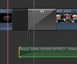

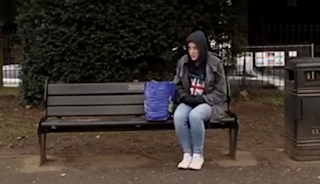
Still this did not reach the 2 minute mark so my group inserted repeated scenes like Emma walking a time lapse instead of the shots we were unable to film or include i.e. the bathroom scene. We planned on going back and filming the graveyard scene at a different, modern location. Yet, upon watching and discussing we felt doing this would add a conclusion to the locket idea, and hence, make the opening scene appear like a short film. Instead, Emma and I returned to Maidstone to film some shots we planned in our storyboard and had to cut. This involved the bench scene of Angel walking away from Emma in disgust, before realising that he will be in the "scum" scene. Instead, I was used in the recreation. 

Other realisations while editing included the talking on camera, blurriness, shakiness, continuity errors and other incidents where unwanted props were in frame. Some of these were sorted by using "Stabilizer" and sound manipulation. Yet, one issue included the begging shot, unfortunately where I can be seen holding Emma's bag. Nevertheless, sadly this is included in the film opening as no one failed to notice apart from myself. Including the newly filmed shots allowed for no repetitions and the film to reach the 2 minute mark. With this in mind we began colour grading, manipulating sound and adding in the credits.

Above: A long shot.

With all the shots finally added correctly, I began with Angel to colour grade. Previously in preparation I researched colour grading and attempted a dark, grimy style. Angel and I both agreed this was too dark and didn't suit the atmosphere we wanted to achieve. Instead, Angel began editing the colour of the waking up scene. As a group we decided to use a low saturation, slightly dark and muted palette. Angel tried to remember the changes almost like saving a preset, that I did in "After Effects", but found that due to different lighting of clips the colour is different. So, I helped altering the colour of the clips in the montage where the lighting was different. I did this by eye, which is not very efficient but it got the job done.

I did have an issue with maintaing the skin tones without making Emma look washed out due to the low saturation. Though this would help the overall effect that Emma is homeless and most likely looks malnourished. The most significant issues was with the artificial lighting of the Oxford Circus tube station. The light meant that there was a yellow bright hue that I was unable to remove. I tried altering the colour by adding contrasting blue hues, but this looked slightly to cold. I also tried lowering the saturation but the skin colour was not right. Instead, my group collectively decided that the following look would be okay.
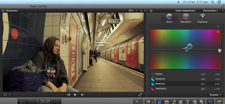

Some other shots including the time lapses include bright colours which affected the colour grading process. Another issue with this time lapse is the sound. Most of the clips were muted so I knew I had to add sound to them, but we left this clip's sound as it is. We wanted a collection of harsh, loud urban sounds like trains and sirens and quieter urban sounds to reflect the mood and feelings of the protagonist in certain conditions. This included the addition of a loud echoing train sound during the confrontational "scum" scene, which rings out to emphasise and parallel the impact of the insult. 


Yet, with this clip as we sped it up, the sound is also sped up. Our group queried over the idea that it seemed ridiculous especially with high pitched siren, due to the change in speed and pitch, but we stuck with the sound as we felt it had the urgency and collective abruptness of urban sounds we wanted to achieve.

The collection of urban noises was further developed by layering the soundtracks sourced as well as my own. I messed around with the volume to make certain sounds fit better, this was enforced by the use of the 'fade' tool that allowed me to layer sounds more effectively. However, the sound at the beginning of the opening scene is not exactly fitting, as the noises are of close traffic, while wanted more hushed and distanced traffic. Similarly, there are some shots of footsteps and passing people's conversations, although this adds to the atmosphere, is not exactly fitting when distanced pedestrians are seen instead of those close enough to hear their footsteps. An example of this is when there is a change in focus behind Emma as she removes her hood.


On the other hand, I felt the most successful sound was the start of the montage, whereby Emma closes the locket and it cuts to the title. The closing of the locket sound was located by the following site by Emma and we felt it was fitting. It was incredibly hard to try and get it to snap at the exact time, but after zooming in and adjusting the position of the snap with the frame of the locket shutting I felt it is fairly tightly done. I also manipulated the volume of this sound clip to make it quieter and less obvious but still remaining the impact as it transitions to the title. This impact was done by removing all sound apart from the echo of the diegetic locket snap as it cuts to black to make it more sudden. However, Emma and Caitlin commented that it is too loud. I tried making it a little quieter, but the volume was still queried. I think this was because of that echoey sound that heightens the snap. I thought this was effective, but I think the rest of my group was unsure. Unable to change the echo in the clip we moved on. 

Next, Angel and I decided to introduce sound when the montage starts. This later developed to myself adding a loud car honk as soon as the title appears to gain attention and, therefore, create a bigger introduction to the film. This was quite sudden after the silence, so using the fade tool I was able to make it more subtle while still producing the impact I wanted to achieve. This non diegetic continues as a diegetic sound of the following clip to allow for a smooth transition into the montage.

Other less obvious diegetic sounds include the quiet diegetic rustle of the bin bag as Emma initially wakes up. This was also sourced by Emma, and like the locket snap, I had to try and find the appropriate frames to add this rustle. Once all of this was done, Angel began to add the credits.

The timings of the credits were decided by Emma and used Caitlin's simplistic white font like the typography of the title that conforms to social realism films. Although, other social realism film openings don't include any credits, the brief we had to fulfil included the use of credits. We were worried due to the montage that adding credits would make it seem like title credits, which is not what we were aiming for. Yet, influenced by my "Maniac" deconstruction, which also features quick cross cutting of locations, similar to a montage, we decided to add them in with a simple fade animation. We didn't want credits just to appear, and due to "Maniac"'s similar shots that use credits that slightly fade and glow, we thought this was best.

Without any credits in social realism films we have deconstructed we were also unsure whether to include just names or titles like "Directed by David Fincher" in other credits sequences like "SE7EN". Emma went plain and simple with just names most of which were made up so it didn't seem too much like title credits.

Personal Comments


Overall I felt the editing process was quickly and efficiently done. There was some tensions between the group in decisions, but we were all able to communicate fairly well. I felt more research could have been done in the conventions of social realism films so that we could make it more identifiable, but I think the actual footage with some errors and issues with mise-en-scene was what made the film not entirely what we wanted to achieve. Especially with the removal of the graveyard scene which Angel was worried about incase the film loses its only plot and context. Though I am happy we decided not to include it, as I agree it would look like a short film and I think it would cause more tensions while editing. Although, the removal of these planned shots could make it seem too simple, the amount of depth in our ideas around typography and sound, is what I believe made our piece successful.