Sunday, 29 January 2017

Music Research #1

Music Research 

For our movie opening Cardboard City, we decided that we wanted to accompany the clips with a non-digetic background track alongside the diegetic sounds of the bust traffic. This is because rather then focus directly whats on screen, a good soundtrack could help to set the atmospeare of the movie and intensify emotions within the audience. The problem with finding a good soundtrack is that most songs which are composed to a super high level are copyrighted, prohibiting us from using them within our movie. However sites such as Soundcloud and Youtube contain high levels of selfmade content which can be used through premission.

The soundtrack choice for our movie is going to be a more sad, slow track with piano or slow strings, this is too tie into whats going on screen to intensify the situation and feelings for the main character. A channel known as Mr Suicide Sheep has a great collection of songs dedicated to the slow type feeling.


Soundcloud also contains a range of different songs however a lot of songs contain some copyright material as they're reposts of popular songs.

Lighting

Lighting

Lighting is an integral part of anything to do with media, the maniupulation of lighting means that you are able to freely change what you want to portray on screen, to how you want the audience to interpret and react to what you're showing. For example, think about all the horror movies you've seen and all the dark scenes in which all the horror happens. Change all the lighting to make it all light and bright, and what do you get as an end result? Something which completely ruins the atmospheare and fails to scare you, such is the importance of lighting.

Through the use of lighting can allow a scene to transform into something from this.

 To this.

As you can see in the orginal picture, the only and primary source of light are the lightbulbds overhead the character, this gives the whole scene a very monotone and 'boring' look as the colours on the wall look washed out and dry. By using stand lights and bouncing the light off the walls to give it a lesser intensity, it adds a more deeper light, for example if the person was to directly point the light at the subject, it could give a shiny outline ruining the atmospheare. Also the use of candles at the background helps to add little more for the audience to look at instead of it just being dark and dull.

Evaluations:
(+) Lighting is an integral part of the video, it can make or break some scenes.
(-) Although it is hard to manipulate, lighting on a low budget mostly comes down to the weather outside.
(+) Using lighting to contrast some colours helps to increase the intensity in some scenes.

Editing Practical


Editing Practical
As we are including a time lapse in our final product we had to take a long clip of a stationary shot, we didn’t complete a proper time lapse as our time in London was limited. We did the shot on the side of a busy street, the footage we captured then had to be sped up, we did this by increasing the speed 500X. The speed that we increased the clip was debated on several times as we wished to keep the sound from the original clip and we didn't want to distort is too much that it was unrecognisable and we didn't want to have the clip so slow that it was just a sped up clip of traffic. after several different speeds we decided on 500X. This clip was then inserted in the correct place in the montage and effectively created a time lapse like piece of footage.
After making the time lapse like scene we split it in two and moved it so that we could use it as two clips to help break up the singular footage of Emma’s character. This was done with a few other clips as well and we found that it helped the montage keep interest instead of making it boring. we later changed this so that we used a different bit of footage for the time lapse o that we didn't seem as though we were repeating ourselves.
As our clips overlapped the time allocation we were given we had to cut some shots to make them shorter, we did this with a long shot of our character leaning against some wooden doors, we found this shot effective yet as it was a still we had to cut it down to make it a more appropriate length, we later, after consideration, made the shot longer again as it was our best shot so we wanted it to have the most time on screen, we also added a title to the shot so we needed more tine for the title.
We had left a blank space where we wished to insert our title which will be white text against a black screen, this had to be an appropriate length as it needs to be establishing yet not be too drawn out either, this was simple in its execution. when we later added the tile we had the black screen immediately after the shot, before adding the title screen in, we made this seem professional looking by adding a blaring train horn before the title became visible, this was effective.
A lot of the editing process is just re arranging the clips to get the best out of the footage that we received, by carefully placing clips in a certain order we could create a montage that would be effective and not too repetitive. we also needed to be careful with sound as some shots were louder than other, by minding this we were able to get the best out of the footage we had yet it took a while to get the perfect order. The order of clips often changed as we realised that somethings didn’t fit, or made the sequence seem forced of clunky.
I also did some colour grading on one of the clips, it was the tube station scene as the original footage was really yellow, to counter this I made the shot more blue and downed the contrast ad so the colour seemed more drawn out, this was something we included in all the shots to make our character more devoid of life and happiness. This editing of the colour was appropriate and as we made the colour seem drawn out in most of the shots we managed to keep the bright blue of the double doors in our best scene.

Typography and Title Practical

Typography and Title Practical


As we have decided that the title of our films title will be ‘Cardboard City’ I used Photoshop to experiment with different fonts and colours. As the running theme of our film is social realism we decided to keep the title simple and have no extra effects so that it reflects the stripped mood of the film opening. This choice has also been made by looking at other film titles like ‘The Selfish Giant’ and ‘Fish Tank’. Although the font they use is unavailable to us as a group we did look at similar font before deciding on ‘Tw Cen MT’, this font resembles the one used for Tube Stations.
I originally completed the colour samples in a different font, before searching through different fonts to find the one I wanted.


After finding the right one I added another colour samples. I chose to do shades of blue as our opening scene has some contrasting blue colours that have a very effective look and I wanted to incorporate this into our title, the idea of a coloured title was taken from the movie posters at the top of the page.


As we will have our title on a black screen I decided to complete the samples with an accurate presentation.

The colour samples shown may not be used in our final product but they are a baseline as to what we want. I also did a sample using pink but I decided that it would not accurately reflect the toe of the film.
Final product

Saturday, 28 January 2017

Title Research


Title Research

Fish tank

A feeling of isolation from society, feeling as though you are in a fish tank suggests that you are seeing the world through glass and not fully connecting to your surroundings, that you are alone. This title relates to how the protagonist feels throughout the film. As a representation of a teenager, Mia is conforming to the ‘misunderstood’ and ‘rebellious’ characteristics that are commonly shown. The tile is shown as separate words in white on an all-black background. The font is shown in all capitals and is narrow in appearance, this is common for this genre as it is also featured in Trainspotting and The Selfish Giant.


The Selfish Giant

Named after the Oscar Wilde story of the same name, ‘The Selfish Giant’ shares little similarities with the original story although the moral presented is the same; the idea that selfishness is the main obstacle between humans and happiness. This idea of selfishness is portrayed in the film as it s commonly associated with young teenagers, like the two boys in the film. This parallels with he title and it relates throughout. Like ‘Fish Tank’ the title for this film is all white capitals on a prominently black background. The text in the title screen is spread out over the width of the screen, the typography similar to the one used in ‘The Imitation Game’. This is possibly due to the fact that the film can be found under the drama genre.


Submarine

Much like ‘Fish Tank’, ‘Submarine’ is about a teenager in a coming of age plot. The use of the word submarine for the title indicated that the protagonist feels under water at some point in the film, this is basically a metaphor for the emotional placement of the character. By feeling underwater, the protagonist is feeling cut off from the outside world much like everything around him is not connecting to him. This is relative to the film as it features a teenager and in film teens are often presented as cut off from other with their emotions, often feeling isolated and alone. By calling the film submarine it effectively symbolises his isolation as well as fitting in with the theme of water, which is presented throughout the film. The title is bold white text separated into three letters at a time so that the word takes up the whole screen. The previous scene is visible behind the typography. The text can be mistaken for being handwritten, this is commonly found in teen dramas, this film can sit comfortably in that genre.


Shifty

Shifty is a word often used for characters that are untrustworthy and deceitful, often evasive. By just looking at the title you can get a slight understanding about the film. As an urban drama, the film has the common conventions of drug use and a run-down location. The title is also the name of one of the characters in the film, although it doesn’t belong to the main protagonist it does belong to secondary character seen who is also the character that drives the plotline. The text, much like ‘The Selfish Giants’ is spaced out but not in capitals, instead it features an all lowercase title, white typography against the image of one of the characters who is, at that point, unnamed.
Evaluation
In my previous inspiration post on the small area in London called 'Cardboard City' I have decided that this title will be beneficial to our film opening, by giving enough context through the title of the project it also relates to the content that we will be portraying. By then having the all capitals white text over a black background it will be conventional to our chosen genre of social realism.

Inspiration- Cardboard City

Inspiration- Cardboard City


The original Cardboard City was located near waterloo station in London, populated by an average of 200 homeless people in the mid-eighties, the site was seen as a symbol of how our society had failed to eradicate issues surrounding homelessness as well as homelessness itself. By 1998 the majority of the residents had been evicted and moved to housing by the London borough of Lambeth, although there was speculation as to how they would respond to housed life.
Through interviews with the residents when the site was being evited it was found that some residents had been in the underground pass for up to 30 years and were reluctant to leave. The whole site was like a community, each person having friends and neighbours as well as their allotted plot.
The site is now occupied by the London IMAX theatre.
The idea that hundreds of people migrated to this one location due to the fact that they had no here else to go is a powerful image and I feel as though it is a real-life situation that we can incorporate into our film opening. By naming our film opening after the famous location we can incorporate the symbolism that it posed through the eighties and nineties, I believe that this will lead to a subtly effective message that we will portray.

Friday, 27 January 2017

Production Companies

Production Companies

At the beginning of our film opening we need a short clip for a major production company and an independent production company, choosing from those we have made ourselves.

Major Production Company

For the major production company we have chosen to use 'film 4' because they tend to produce films in the genre of social realism more than more common major production companies such as Warner Brothers. This is the most recent logo clip from 'film 4' that we will put at the beginning of our film opening.

Independent Production Company

We named our production company 'CANE productions' as it involves all of our initials (Caitlin, Angel, Natasha and Emma). We then all made a short clip for our production company. Having watched all of the clips we decided the most appropriate for our film was Natasha's. This is what she created.


Editing

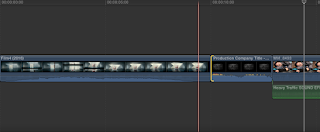
I am going to show how I put these videos into our film opening. Starting by downloading the videos from YouTube. I did this using a mp4 converter and saving it to a file in my videos.


Next I imported them into Final Cut Pro so it was with the rest of our footage.


I then dragged the clip for 'CANE productions' into the front of our footage and cut off the introductory part of the video by dragging the end of the video in.


Next I dragged the clip for 'film 4' in front of the clip for 'CANE productions'.


Timings

Timings

I am going to decide what titles go in and at what times throughout our film opening. These titles will include our names, the name of our film, the name of the production company and some other names we have made up to fill up the spaces and make it look professional because otherwise our names would keep repeating which becomes boring.

1. 'A CANE productions film...'


The first title say 'A CANE productions film...' as most films have the name of the production company mentioned in the titles. In this shot there is a large empty space in the bottom left corner so I have decided to put this text in this shot. The time in the video is 0:08 - 0:14 as the character sits up from lying down. The text will fade in and then out again with enough time for our audience to read what it says.

2. 'Cardboard City'


The second title has the name of our film 'Cardboard City'. This text was originally going on a plain black screen but having watched a rough edit of our film opening it would not suit the mood of the film so we are going to put it in the top right corner where the wall and door is. The time in the video is 0:16 - 0:18. This is also going to fade in and out again similar to the last shot.

3. 'Emma Fuller'

Our names are in order of appearance so the first one is 'Emma Fuller' this will swipe in onto the door as Caitlin walks past the camera it will then disappear as Natasha and Angel cross over in front of the camera. The time in the video is 0:36 - 0:40.

4. 'Caitlin Willis'


The second name is 'Caitlin Willis' which will appear in the shot of money being dropped into the cup in the blank space up in the top right corner. This text will fade in and out again and the time in the video is 0:45 - 0:47.

5. 'Natasha Russell'


The next name is 'Natasha Russell' this will appear on the tarmac in the playground in the bottom right corner of the screen. Once again the text will fade in and out at the time of 0:50 - 0:55.

6. 'Angel Limbu'


'Angel Limbu' will fade in and out at 0:59 - 1:04 as the girl walks away from the camera in the empty space next to her.

7. 'Ryan Murray, Grant Newman, Harper Bolton'


The next title is the first of our made up names which we have grouped together the first three are 'Ryan Murray, Grant Newman and Harper Bolton' these names will fade in in the bottom right corner next to the homeless girl in a list format. They then swipe away as Caitlin walks past the camera again at the times of 1:09 - 1:11.

8. 'Rupert Gunsson, Hannah Abbot, Matthew Young'


This is another group of names made up of Rupert Gunsson, Hannah Abbot and Matthew Young. This will fade in and out on top of this shot showing the homeless girl sat on a park bench in the format of a list. The timing for this will be 1:11 - 1:12 plus time for the fade.

9. 'Sarah Turner, Jessica Brown, Kevin Reed'


The next title is another list of made up names which are Sarah Turner, Jessica Brown and Kevin Reed which will fade in and out in the bottom right corner of the train shot at 1:14 - 1:16 as there is lots of empty space on the edge of the platform that can be filled with this text as a list.

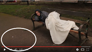
10. 'Amelia Bones, Cole Dawson, Hadley Ryley, Brian Spears'

The final title is four names, Amelia Bones, Cole Dawson, Hadley Ryley and Brian Spears. This will be once again in list format on the tarmac in front of the park bench that the girl is lying on. It will fade in and out in the bottom left corner at the times of 1:21 - 1:22 plus time for the fade as long as it stays on this shot and does not spread into the next one.

Monday, 2 January 2017

AS Media Visual Effects In Social Realisms Source Of Inspiration

Visual Effects In Social Realisms Source Of Inspiration


Brief


However, I want to explore visual effects used in social realism, so that some of our post-production will conform to common conventions. So, I looked at social realism film "The Selfish Giant" with its use of VFX and other effects including lighting, colour grading etc. to support the plot that is fairly different to our more urban narrative. I wanted to look at something slightly more different to our opening, but of the similar genre, so that I can see how visual effects are used to help the different, rural atmosphere, and hence, allows me to understand what works and apply that to similarities in our film opening. Also, any differences in narrative means I could oppose the drama's effects to see if I would create a more suitable atmosphere for our film opening, i.e. I could use opposite colour grading etc. for a more urban social realism film compared to the rural film.

The film is seen below:


Genre

Conventionally, in urban dramas editing is very minimal to emphasise the realism aspect. Therefore, as we chose to create a montage, this subverts common conventions. In urban dramas, however, montages or fast paced editing are commonly used for scenes like fight, confrontations or some sort of tension. This was analysed previously.

Post-production


In "The Selfish Giant", the shots use the effect of colour grading to alter the atmosphere and effect of the film opening. The saturation is low to add a grey, hazy effect that emphasise the poverty in the boy's situation. The character is also incredibly hyperactive, so lacking this colour contrasts his energy and anger, which consequently emphasises it. Instead, the tones centre around cold muted blues, pale yellows and muted grass greens, all of which lacks brightness due to the lack of saturation and very dark brightness. This is also planned due to the mise-en-scene. We can use this low saturation to, therefore, to show the homeless protagonist's poverty.

From left to right: Handheld, tracking long shot, a long establishing shot and a two shot with a long shot of boy waking up in background in focus.

However, the earthy colour grading emphasises the drabness of the rural Bradford location in "The Selfish Giant", therefore, to oppose this we can use more blue tones and artificial colours like red and neon colours, as analysed in "Fight Club", to portray the intimidating city life in busy, intimidating London etc.

Inspiration Blog

Inspiration- Cinematography

Cinematography was always a subject of film-making that highly interested me, and after watching multiple self made short films and people on Youtube such as DSLRGuide it only made me want to try it more. Kold is a great source of inspiration when it comes to cinematography and the unique transitions that he uses. Kold gained a major following upon the release of his Hawaii edit, where through the use of his innovitive transitions he displayed his level as a filmaker. DSLRGuide almost relgiously follows a philosophy in which he explains that, 'It is what is in front of and behind the camera which is more important than the camera itself' telling us that it does not matter how expensive of the gear you are using, if you, yourself as a filmaker isn't competent enough then it won't make your content any better. He proves this himself by realsing guides into filmaking and films most of his videos on a Canon Rebel T3i (considered outdated in terms of the camera market) and still manages to compose beautifly crafted short videos. It is because of people like this and the cinmatograpic reels they make which attracts me to doing filmaking and possibly pursuing it as a carrer.

AS Media Storyboard Comparison Practical

Storyboard Comparison Practical

Brief

After the shooting days we compiled the following clip influenced by our storyboard:


We have made several differences. We have removed the graveyard scene also because the lack of unsuitable locations and the response that it may make the opening seem like a short film, as the scene acts like a conclusion. Similarly, we removed the bathroom scene due to similar issues with the low key lighting toilets. Instead, we extended some clips in the montage.

I want to produce a clip that shows the new order compared to the first draft below:

Outcome


Below is a (poor quality) clip of the above clip compared to the storyboard:


The initial storyboard was then adjusted with the order of the current opening shots we filmed. Any new shots were added in with the actual footage. This is seen below, like the one above the resolution is unfortunately very poor but allows us to understand the narrative and transition of the new shots in comparison to our storyboard:

AS Media Day One Filming Practical

Day One Filming Practical


Personal Comments

Following my shooting script, by 9 am we were all supposed to meet at the bottom floor of the Mall in Maidstone to get ready to film our opening scene. We got off to a bad start as only Angel and I arrived on time. Communictaing to the rest of our group we later decided to meet at the McDonalds in the Mall at 09:30, consequently, according to my shooting script we would have less time to film.

Though, I did set the times of the script generously and so once we moved to location that was behind the Mall and near the Gala Bingo we managed to start filming at around 09:45, still giving us one hour to film.

I thought the location was very successful as it had the very 'grimy' and 'gritty' feeling most social realism films have. It was very dirty and the added feature of a flickering light gave a sort of cinematic style, which we included and accentuated by precisely framing the opening shots. At first it took a while to get prepared as we had a lot of stuff crammed into many bags. Also, we had to cut up some old bin bags to lay down on the dirty floor to not only act as the base in substitution to the cardboard we were planning to have, but also so Emma would lie down.


When we started filming we were a lot quicker and rattled through the storyboard. I felt at some points we should have put in some more care as it later led to slight continuity errors, but we were slightly wary of the Bingo customers and delivery men driving down the alley where we were filming. Although they told us it was fine, we did miss out some shots and others were not polished. This included the match on action of pulling out the locket and also the shot of many people walking past.

This shot that we were going to speed up was not accomplished due to only having three available group members and the location being fairly isolated from walking pedestrians. I felt this shot was one of the most significant in the opening scene to show the homeless protagonist's isolation, but we decided we can do it in London.

We finished on time roughly, but instead of watching shots over and filming the less polished ones, we moved on and to McDonalds again. I felt time was precious and it was probably best just to crack on and film, however, as Caitlin woke up late she did not have breakfast and we agreed to go to the McDonalds on the way to Brenchley Gardens, where the bench scene was to be filmed.


After the stop at McDonalds we decided to stick to the shooting script and quickly film the sign and money shots. Walking up to Brenchley Gardens we found a quiet street off the side of the high street and filmed these shots. We realised that as Caitlin, Angel and I walked past the camera already we should have got some other extras or a spare change in costume so that it didn't look like the same people interacting with the protagonist. So we took off our coats and I wore Emma's coat so it looks slightly different.


These shots too were very quickly filmed and we were now ahead of the shooting script. I felt that we could have done some extra shots due to cutting the time lapse and some other shots in the waking up scene. Yet, we moved to Brenchley Gardens and again without hassle quickly filmed the bench scenes.

When we met to film at London we discovered that during this bench scene we shouldn't have casted Angel as the man that walks away in disgust, as he was used when bumping shoulders with Emma in Brixton. Again, more care should have been put in. The locations weren't also the best to choose I felt as we seemed to just pick locations off the tops of our heads rather than thinking of the genre, colour grading, the lighting conditions and the situation. I felt more research could have been done and we should have all communicated in deciding the perfect location.

This issue with locations continued as no other alternatives to the very old Archbishops graveyard were found and decided. So, ahead of the shooting script we had to make do and film there. Hence, it took a while finding a specific grave that looked slightly less old, had other graves we can pan from and had some sort of urban feature to it. I felt the choice wasn't the best because of the limited options. The pan was not really what we had planned as we did not have a slider and there was limited space to do a dolly shot, but we carried on. Caitlin and I offered the idea that we could always find a graveyard at London and retake the shots but in the end this was not completed.


Other retake shots we planned to later do in London included the bathroom scene, but this too was not completed. This was filmed after lunch break at around 13:00 as we were ahead of schedule. We used a location scouted by Emma of the toilets by the Café at Mote Park. This was chosen because of its dirtiness, which was heightened by the feature of a needle bin. Yet, when we arrived the toilets were actually cleaner than I expected. Not only did the toilets lack the rubbish and 'grime', but they also lacked suitable sinks, mirrors and light. This meant we spent a lot of time trying to get the automatic water to work for shots that were low quality. This too meant shots were cut from our storyboard.

Although everyone planned to leave at around 17:00 due to the shooting script, we finished filming at around 14:00 and stopped at the Café to download the footage. 

Personal Comments


Despite, not exactly completing all the shots we planned and the stress, we had a good time and found the production of opening fun to do. This made us feel better and optimistic about our film.


Sunday, 1 January 2017

Filming Evaluation- London

Filming Evaluation
London

Shots completed
We chose to complete the other half of the park scenes in St. James park, although this was not the ideal realistic location it was busy and had the families that we needed in the background to make the scene effective. We filmed the scenes at an angle so that we didn’t have the wealthier part of London visible to the camera, we also chose to the angles as they would not focus on a civilian’s face, this helped us avoid offending the other people in the park.
We also completed the walking scenes in London as the streets were busier so we could capture a better ambience. We did these scenes in Brixton and Hyde Park (Winter Wonderland), we chose these locations as they were densely populated whilst we were filming, this gave more thought to her being alone but surrounded by people.
Whilst we were in Brixton we decided to use a tall arch to film some scenes, these included a long shot of the character in an alcove next to a large dumpster. This was reflective as the area was sheltered and ideal for a homeless person but it was so close to something unpleasant but choice is not available to some people.
Using the same arch as the street scenes were filmed, we filmed the scene where the character knocks into a civilian who looks down on her and calls her ‘scum’ there was some graffiti in the small side road and it was next to a busier road that had several people walking past it.
As we needed to use the subway to get back to the train station we did an unplanned shot in the subway and on the train, there were possible as the train and stop were basically empty, these scenes were effective and are commonly seen in movie scenes with homeless people present. They also held a different tone as they weren’t planned so we improvised the angles and the positions of the character and the timings were also unknown.


Pros
Filming in London gave us a lot more flexibility and options as to locations. It also gave the illusion of a busy location as even when there were few people the road traffic was loud enough to signify any presence with the loss of foot traffic. London also gave us the rougher graffiti covered areas that Maidstone didn’t have. Filming in Brixton was useful as it gave us a densely-populated area that was busy but not overly so meaning that we could get more shots from a distance and a time lapse shot could be completed without a chance of offending everyone.

Cons
Issues with filming in London were that as it was more densely populated and due to the time of year it was that we filmed we found that there were a lot more people in the areas we wished to film, this caused issues as we had a higher chance of offending people. Another issue was with the parks that we came across as only the ones in the nicer areas had families present, this meant we had to find angles that didn’t give away the location and still keep the other people present in the park anonymous. London also meant that we had to pay more for travel and essentials through the day and it took longer between shots as we had a longer distance to travel. We were originally delayed as our train was seven minutes late but this was not an issue in the long run.
Evaluation
Altogether we had a successful day, although we did not have time to find a public toilet to re do the toilets shots that we needed to do there was no other shot we did not complete. Although it was harder to film in London due to the crowds it had better location that we could film in giving us a larger range to choose from. Although we did come across issues of trying to film without offending people we also managed to avoid any confrontation with anyone that may have felt as though our filming was inappropriate.